Nothing boring or neutral about these paint selections.
Vail Design at Altitude column
By: Slifer Designers
Spring is the perfect time to update the house. The easiest way? Clean, new paint, which breathes fresh life into your home. Slifer Designs’ experts weigh in on tips and color ideas for homes throughout the valley.
Before you pick your color, do some research on the finish. Senior designer Marilyn Heaney suggests, “Before you pick your color, decide what finish is the best for the space.”
Here’s the quick and low down from Marilyn: Matte or flat has no sheen—ideal for ceilings or if there is a lot already going on in a space, she explains. Warning: fingerprints are obvious on matte finishes and it’s nearly impossible to wash them off. Eggshell is popular; it has a very slight sheen and is washable. Satin finish has more of a sheen than eggshell but isn’t shiny, and is washable. Semi-gloss allows for more reflection. Best to be used in high-usage areas (think baths or kitchens and moldings or trim). Finally, gloss is the va-va-voom brightly shiny finish, best for areas that need to be washed frequently (doors, trim). You may want to avoid using it on walls. And, she adds, that she has a hard time picking a color favorite—she relies what her client wants.
Find out what designers love—and their secret insider tips to paint selection. Right now greige (gray + beige) walls are very popular, with good reason. The color can cool or warm and is a lovely backdrop for bold bursts of color throughout the home.
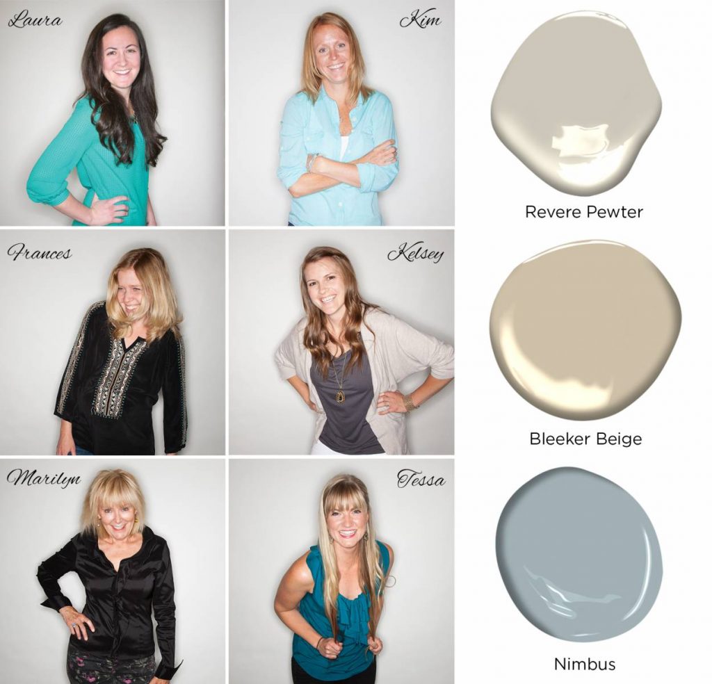
Design associate Laura Butler loves Benjamin Moore’s Revere Pewter. She says it’s the perfect greige with hues that change throughout the day in response to the day’s light.
“Paint samples in the space are a must! Lighting affects how we see color, so it is important to see the sample colors at different times of day and on different walls within the same space,” Laura shares. It’s totally worth buying a few samples and living with them for a few days.
One of senior designer Kim Toms’ favorite colors is Benjamin Moore Bleeker Beige, another “warmed-up” gray, or greige. “Since we live in a cooler climate – I lean towards warmer colors that help to make the space feel warmer,” she says.
Toms adds to paint several walls the sample color, again to see how the light reflects or changes the color. “It’s going to change with different light – you may really like it when you paint it at first and then think differently when dusk arrives.”
Frances Karsh, senior designer, typically chooses fabric first then picks a paint color based on the scheme that complements it. “I typically play it safe in larger areas and pick something neutral. Then, maybe, I’ll pick more saturated fun colors in smaller spaces that are easier to change.”
Kelsey Cole, designer, shares her favorite color is Nimbus. “It’s a nice warm gray that doesn’t come across blue!”
Tessa Hyatt, design associate, is a huge fan of color but she’s also in love with greige. She adds that greige coordinates with myriad of colors but doesn’t feel cold. It’s modern without being sterile. Tessa brings color into design in furnishings and accessories that really pop against the neutral greige.
Tessa adds another fun way to add unexpected color: on the ceiling. “This can be an opportunity to do a fun pop of color like a deep blue. This is an unexpected way to add interest and a more customized look to the space.”
Designers at Slifer Designs love working with colors and neutrals, bringing homes to life for their clients around the globe.