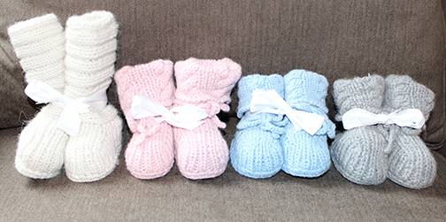
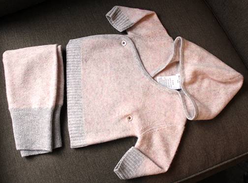
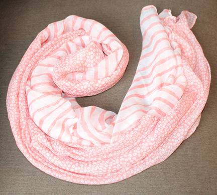
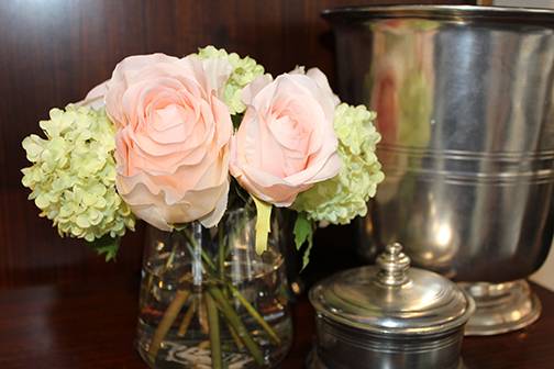
Pantone did it again – picked its color of the year. Rose quartz and serenity (blue). This year, you can envelope yourself in the blending of two colors: a warm rose juxtaposed with a cool blue. It’s easy for us to surround ourselves in these hues with the red rocks that dot the landscape, stunningly set off by the deep Colorado blue sky.
Chosen as a representative way of expressing mood and attitude – Pantone wants us to see the melding and the balance of the two colors, bringing calm, serenity and energy together. Hues of pinks and blues – we’ll embrace it.
When we heard rose quartz and serenity, what first came to mind were nubby, warm, yummy colors for a newborn. Pinks and blues, cozy hues… oh baby!
Not to say rose quartz can’t be lovely for a more mature look.
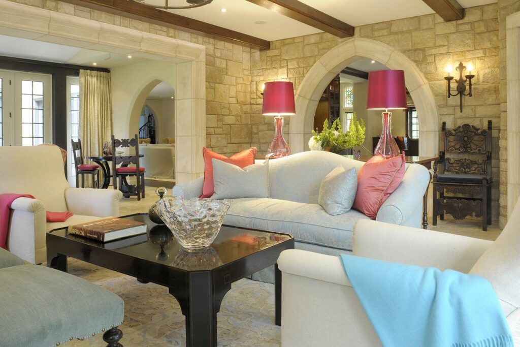
Add a dash of rose to a side table, a hint of pink with a pillow or light-in-color side chair.
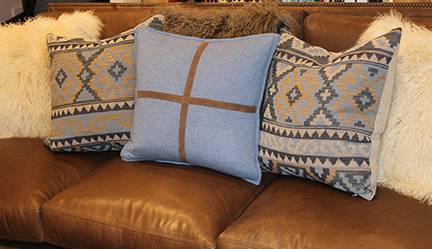
We love using blue, it calms, it cools and it goes with almost any room. Pillows in native prints burst.
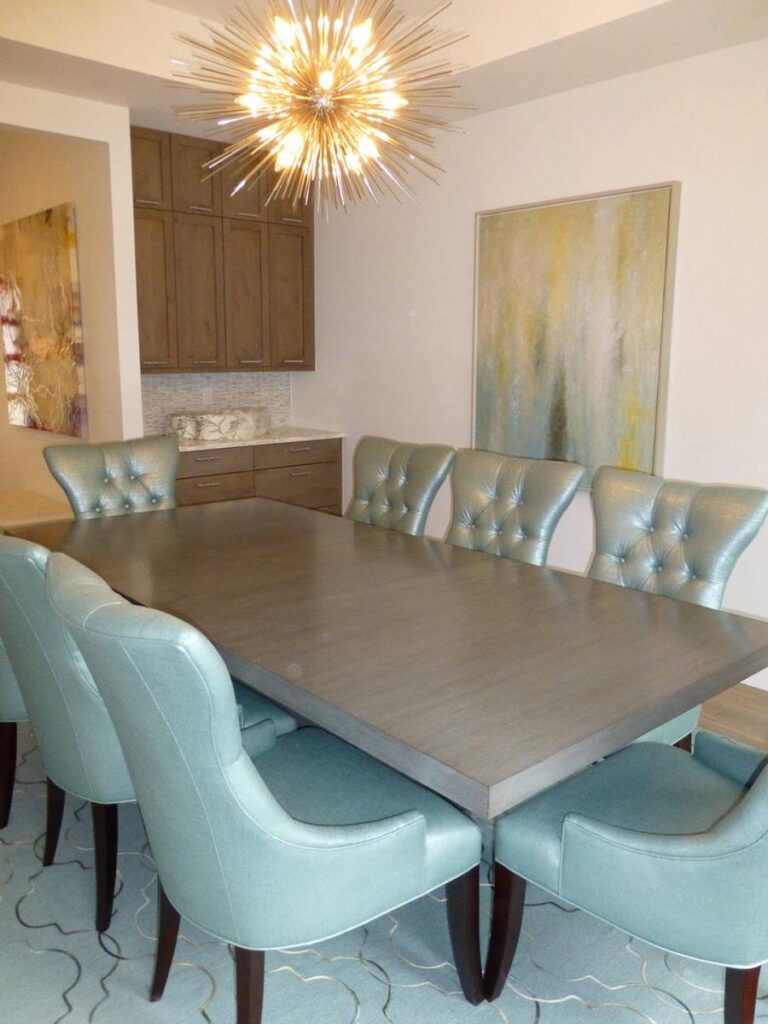
How cool are these chairs? Modern, interesting and definitely blue.
Using rose quartz and serenity together – with your own interpretation – truly makes your house a home. Go ahead, embrace Pantone’s color of the year!

