Good-bye Drab Days, Hello Spring
Spring is (finally) rearing its colorful head. I know we aren’t done with the snow – this is the mountains after all – but I am getting anxious for bright summer sunshine. I love the pops of color poking out from stubborn snow drifts and amidst left-over autumn leaves. I took a walk yesterday and saw a full-fledged bunch of daffodils in a neighbor’s yard. I wanted to stop and smell the roses – or daffodils – and rejoice that maybe, just maybe, spring is here to stay.
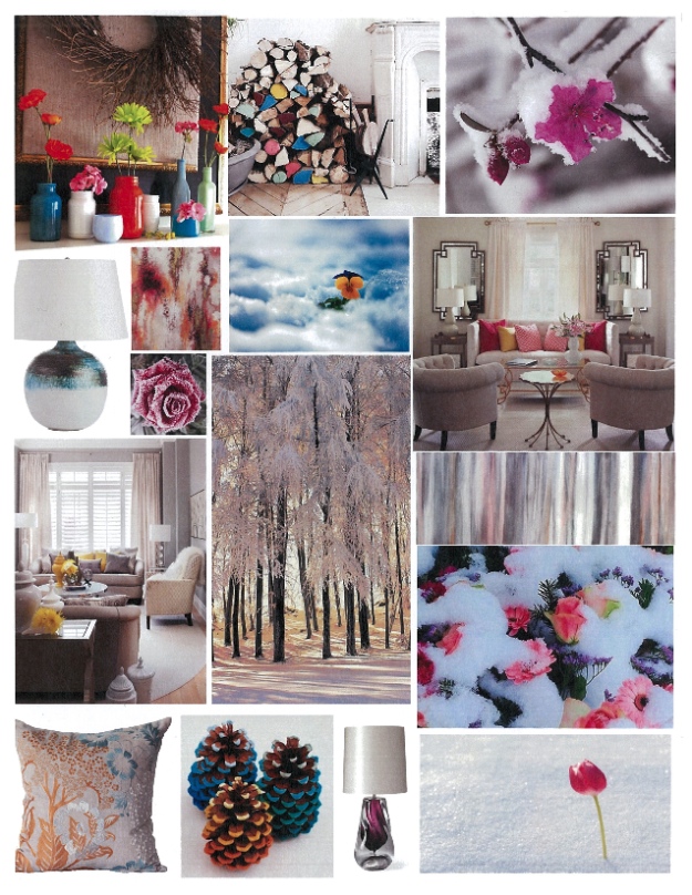
Ah, color. I am particularly drawn to the bright aquas, greens and pinks of this season! I use pops on a bright background, with neutrals and on stark whites. I’ve learned using bright colors on a light background helps energize a space and gives some unexpected excitement to your environment. (Who couldn’t use that right now as the snow is drab and gray and there are days with ominous clouds overhead?)
This time of year, more than any other, I look to fresh bright colors to make spaces lively. Color makes a big impact even with a small budget. There are so many hues to choose from… just look at Crayola, the iconic crayon maker… 29 shades of red. 29!
Really, does anything say ‘spring’ like a bouquet of tulips on your dining room table? It's a versatile way to freshen up a room that can easily be changed. I love adding bright, vibrant and fresh colors to a light neutral palate – whether it’s an entire wall or a simply beautiful accent piece.
Remember, on a gray and dreary spring day – when you are longing for bright sunshine – lift your mood with a burst of color placed just so.
This inspiration is brought to you by Tessa Hyatt, whose Alaskan childhood immersed in nature is featured prominently in her design work.