
A picture is definitely worth a thousand words – and we’re in love with a few of these projects that show just how lovely Pantone’s Fall/Winter colors are. A lot of times it’s challenging to figure out HOW to use a color, or where it will look smashing. Instead of describing with words, we’re going to show you a few of our favorite ideas and ways to use the hottest colors in the world of color.
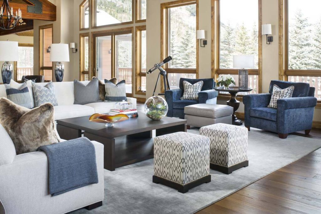
This slate blue is beautiful. It can be a neutral or a more bold pop of color. Best of all, it works in any room in your home. Riverside blue adds a burst of color in an otherwise sedate living room. Notice, though, the blue doesn’t overwhelm or distract, it simply adds a lushness to the space.
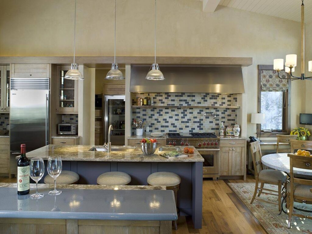
In the kitchen, we love how the blue works in the backsplash, coordinating with the counters. None of it is overpowering but adds a warmth that definitely catches the eye.

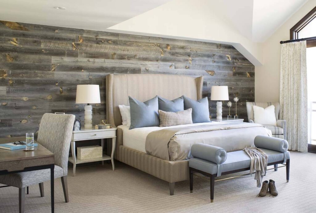
Airy Blue is aptly named. It creates a lightness we love. It works at the beach, in the mountains, and in the city. The reclaimed wood wall has a rustic feel but the blue adds a certain elegance, giving the room a high-end, yet homey, feel.
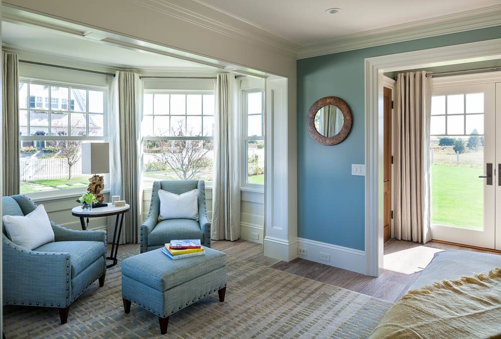
Deciding to use blue arm chairs with an ottoman might feel bold – but adding an accent wall in the same color, makes it all works together perfectly. It shows a bit of playfulness but remains a quiet reading retreat for the homeowners.

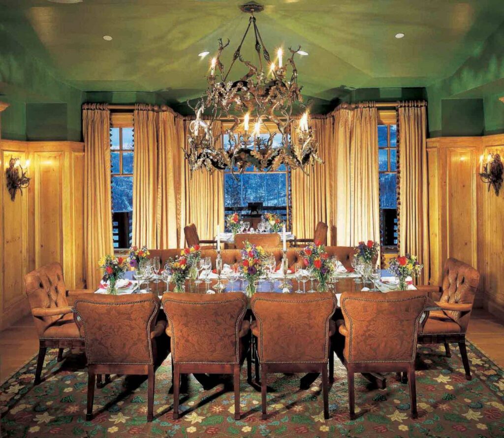
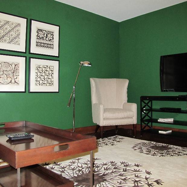
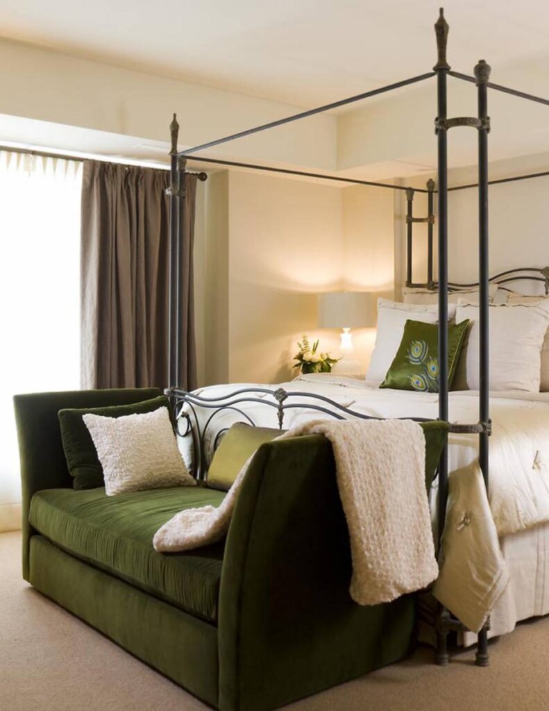
Green with envy indeed. Green inspires boldness. Pantone Green feels like spring itself. And as we go into the drab winter months, it’s good to remember that life is under the frozen tundra. Green is the color of spring, of renewal and rebirth. Try it in an unexpected way – check out the ceiling below. What a fun, unique way to bring color into your home. Green walls paired with a bright white chair and rug works well since they complement each other. Finally, crisp, white linens could be boring – well, maybe – but they simply shine when paired with mellow greens.
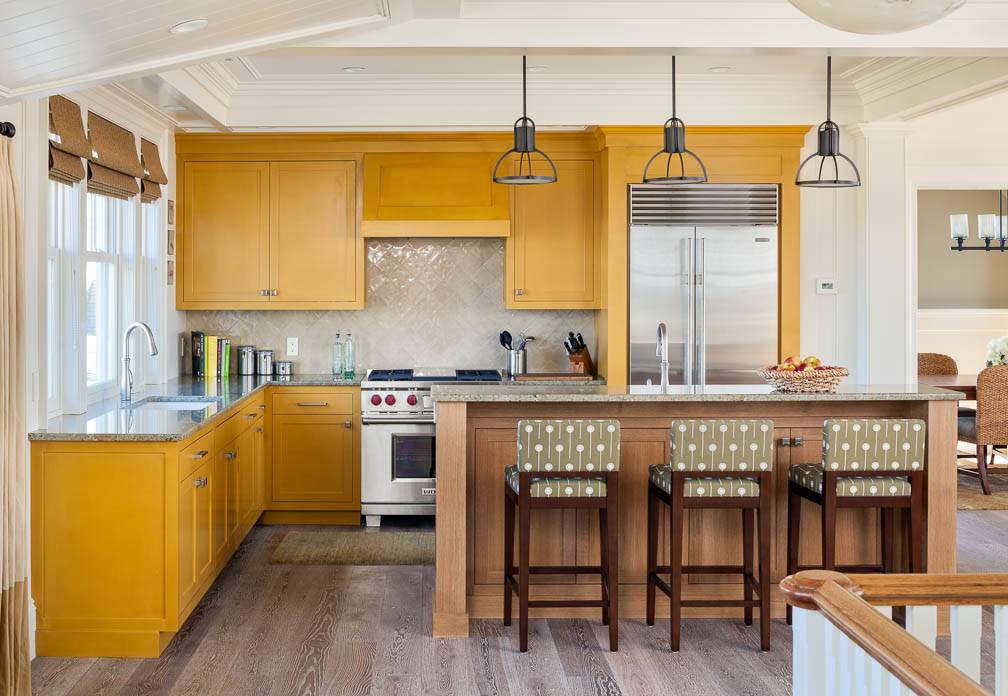
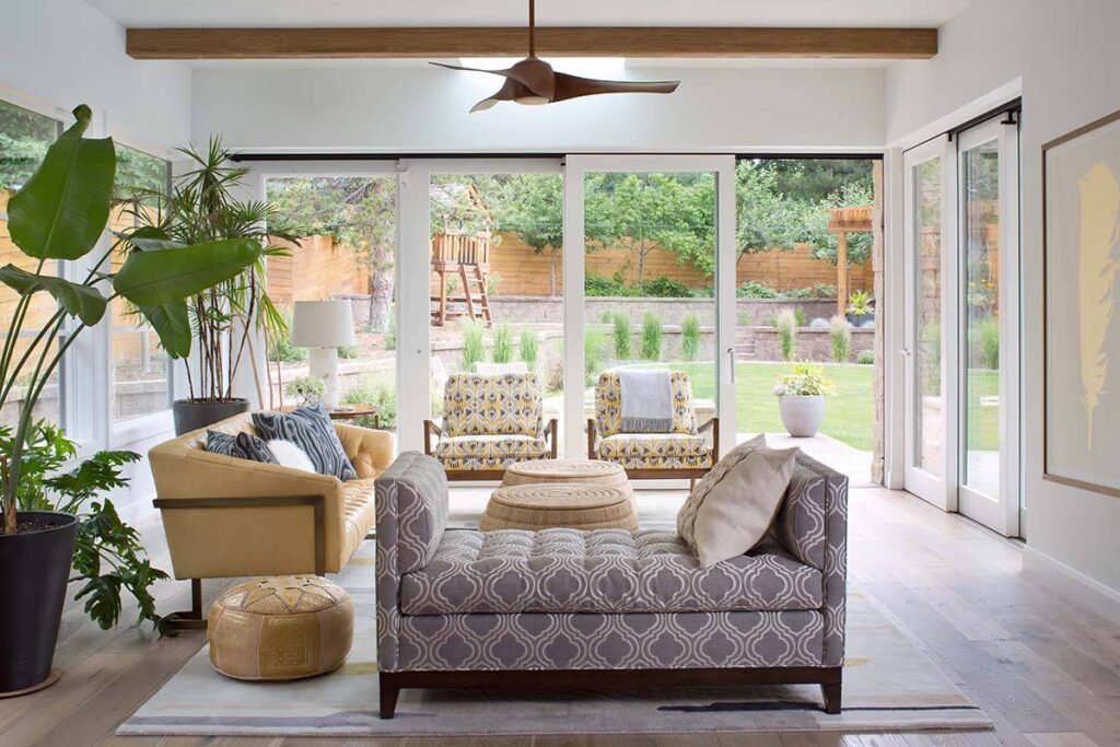
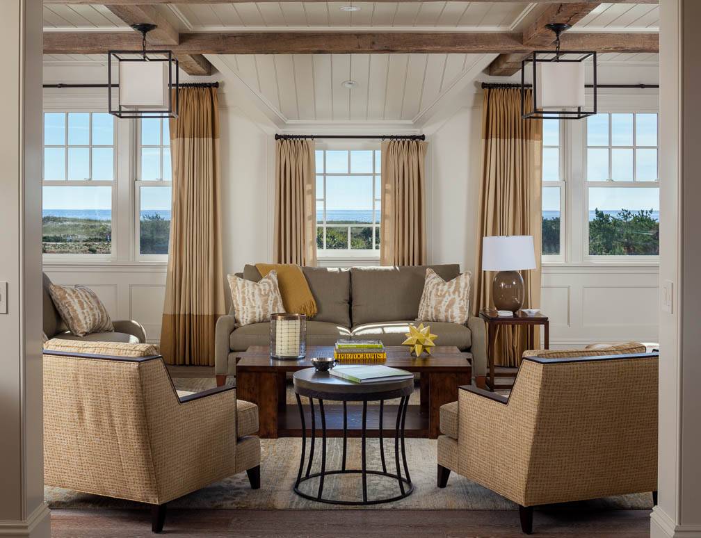
Let’s be honest, mustard got a bad rap in the ’70s. But we are welcoming back its spicy older sister with Spicy Mustard. Best taken in small doses, similar to mustard on a sandwich. It adds a burst but you don’t want to be swimming in it. Pair it with neutrals such as ivory or gray and Spicy Mustard warms as it invigorates.
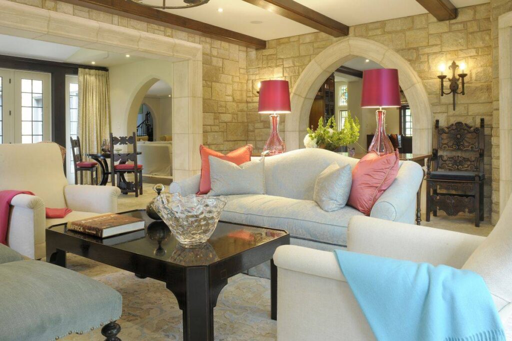
Bodacious! Definitely to be taken in small bursts, this warm pink adds a feeling of festivity to any room. Even classic design needs a boost, which is just what it gets with pink where it’s not necessarily expected. Think about using it in different ways: through art, lamps, throws… it’s all fun!
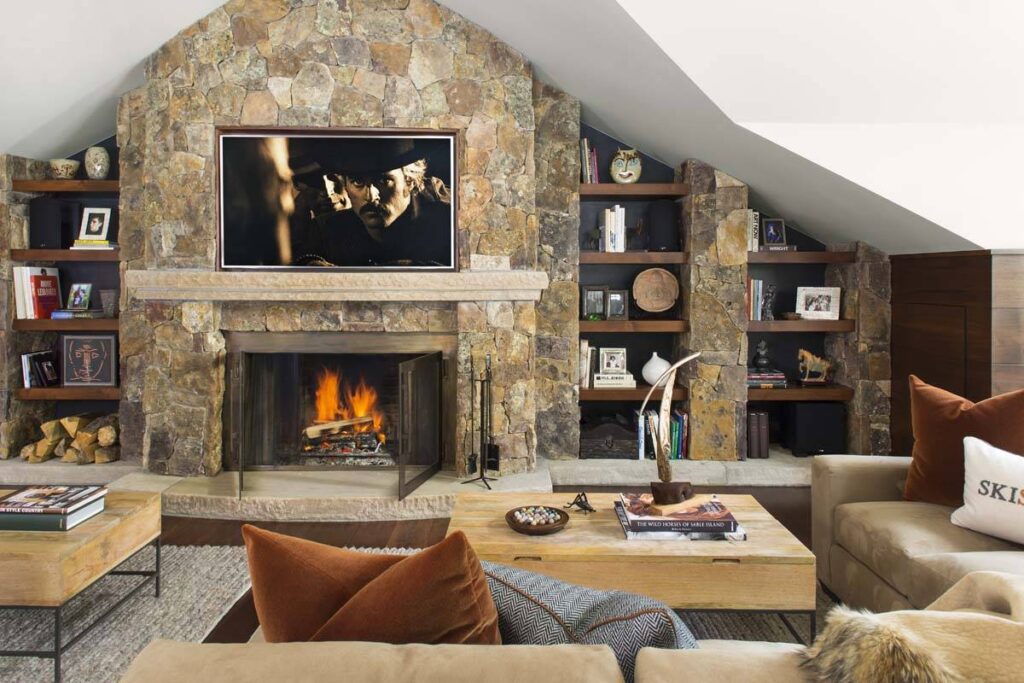
Potters’ Clay is obviously warm. It picks up other colors throughout the room – it’s neutral in a bold way.
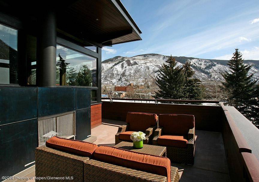
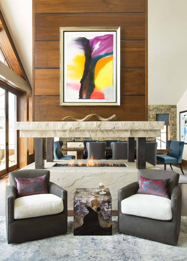
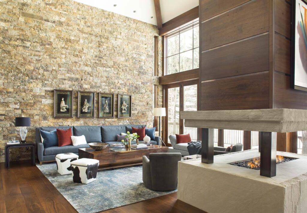
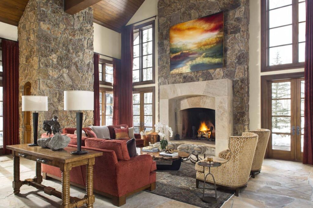
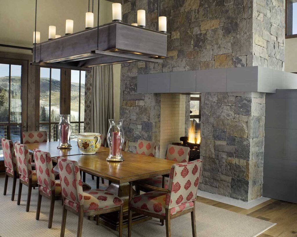
Aurora Red is best in smaller doses. It’s not the red accent wall that was so pervasive in the 1990s – Aurora Red is more earthy and sedate. It works with warm stone walls. Add it in for a pop of color with a throw pillow or throw, try it in a piece of art. It’s warming for the cold winter ahead.

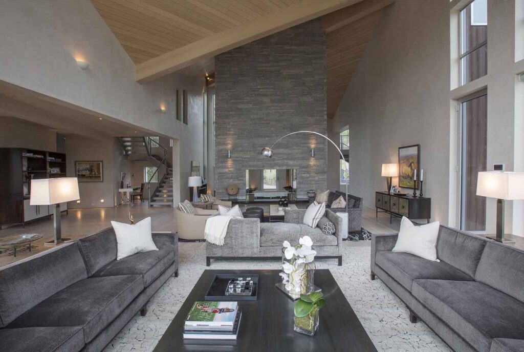
Sharkskin, we adore you. Shades of gray; a gray by any other name… Sharkskin calms but is definitely not boring. Clean and warm, what is not to love> Notice how the white simply bursts off the sofas.
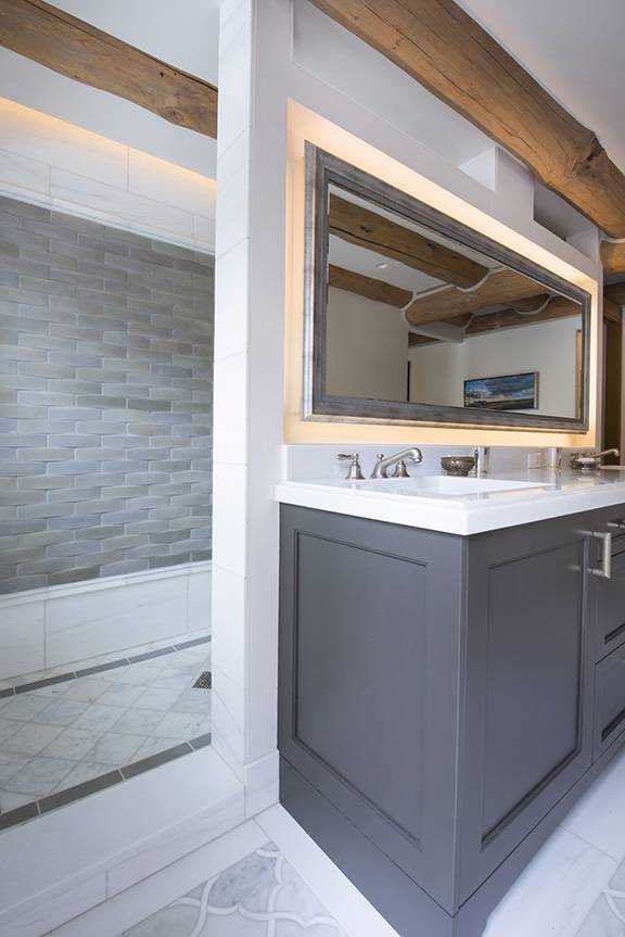
Warm Taupe works so well with clean whites and rooms that need very little. The outside view steals the show here, so why compete when a clean, basic room speaks volumes.
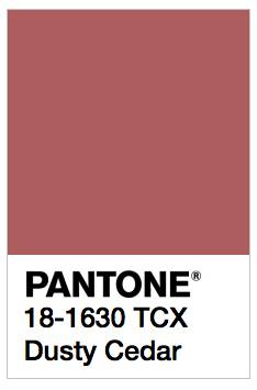
Dusty Cedar is completely unexpected. It shows a playfulness, a sense of taking a risk while not living with the regret of an unfortunate design decision. It brings a smile to your face and warms the home.
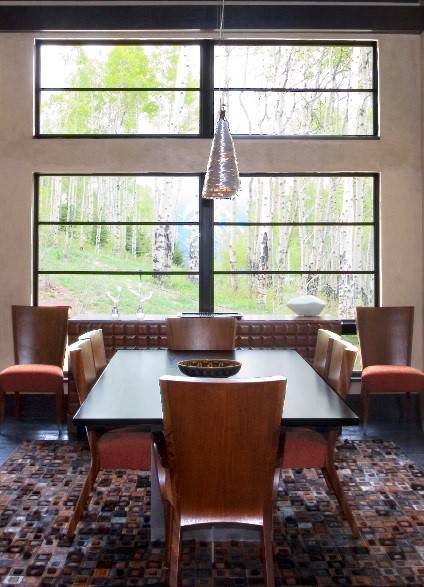
Not ready to change your home? Remember, all of these colors work well in fashion too. Try a swanky scarf or funky hat. Mix it up and get out of your comfort zone – show the world you’re ready to be bold, daring and you know what’s hot in fashion.